Trusted by 50+ brands across sectors


Navigation that makes users think
CTAs competing for limited attention
Information without hierarchy
Performance that costs conversions
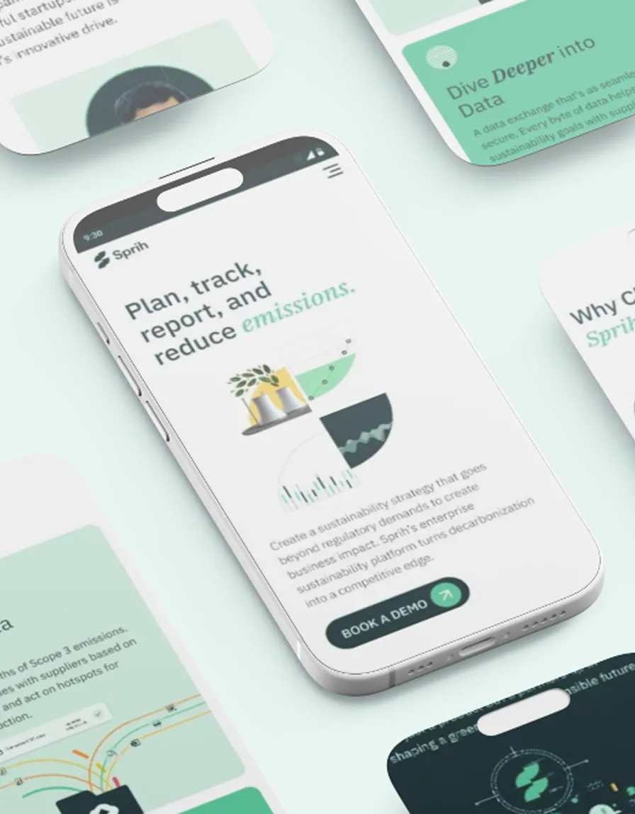
Conversion paths that nudge, not push.
Information architecture that respects user priorities
Performance metrics that keep impatient users engaged
Users don't measure experiences. They feel them.
But we measure what they feel.


Brand-Aligned Design
Lead Generation
eCommerce
SEO Optimization
Analytics

SaaS Interfaces
Mobile Apps
User Flows
Interaction Design
Design Systems

Sales Presentations
Interactive Tools
Digital Brochures
Case Studies
Demo Materials

A/B Testing
User Analysis
Conversion Optimization
Performance Tracking
ROI Measurement

UX friction analysis with prioritized
recommendations
Conversion path evaluation with
improvement roadmap
Technical performance assessment with
specific optimizations
Competitive benchmark report with
opportunity mapping